
| 일 | 월 | 화 | 수 | 목 | 금 | 토 |
|---|---|---|---|---|---|---|
| 1 | 2 | 3 | 4 | 5 | ||
| 6 | 7 | 8 | 9 | 10 | 11 | 12 |
| 13 | 14 | 15 | 16 | 17 | 18 | 19 |
| 20 | 21 | 22 | 23 | 24 | 25 | 26 |
| 27 | 28 | 29 | 30 |
- Chap4 #다항회귀 #PolynomialRegression #ML #머신러닝
- 확률적경사하강법 #경사하강법 #머신러닝 #선형회귀 #ML #Chap4
- 인덱싱 #슬라이싱 #python #파이썬 #수정및삭제 #원소의수정 #객체의함수 #keys#values#items#get#len#append#sort#sorted
- python #파이썬 #pandas #dataframe #dataframe생성 #valueerror
- Chap4 #ML #미니배치경사하강법 #경사하강법 #머신러닝 #핸즈온머신러닝
- python #dataframe #파생변수 #map #lambda #mapping
- Chap4 #핸즈온머신러닝 #머신러닝 #핸즈온머신러닝연습문제
- 티스토리블로그 #티스토리 #PDF #블로그PDF저장
- 선형회귀 #정규방정식 #계산복잡도 #LinearRegression #Python #ML
- Chap4
- 파이썬 #Python #가상환경 #anaconda #python설치 #python가상환경
- 티스토리 #수학수식 #수학수식입력 #티스토리블로그 #수식입력
- ML #핸즈온머신러닝 #학습곡선 #편향분산트레이드오프
- Chap4 #ML #배치경사하강법 #경사하강법 #핸즈온머신러닝 #핸즈온
- 경사하강법 #핸즈온머신러닝 #머신러닝 #ML
- 핸즈온머신러닝 #handson
- Chap4 #릿지회귀 #정규방정식 #확률적경사하강법 #SGD #규제가있는선형모델
- 키워드추출 #그래프기반순위알고리즘 #RandomSurferModel #MarcovChain #TextRank #TopicRank #EmbedRank
- IDE #spyder
- 라쏘회귀 #엘라스틱넷 #조기종료
- 객체의종류 #리스트 #튜플 #딕셔너리 #집합 #Python #파이썬 #list #tuple #dictionary #set
- adp #데이터분석전문가 #데이터분석자격증 #adp후기 #adp필기
- Today
- Total
StudyStudyStudyEveryday
[Python] 그래프 그리기 - 막대 그래프 / Pie chart / Boxplot 본문
막대 그래프
막대 그래프는 특정 값을 가진 범주형 데이터를 막대와 그의 높이, 너비 등을 통해 표현하는 그래프이다.
matplotlib의 pyplot에서는 bar 함수를 통해 막대 그래프를 그릴 수 있다.
R에 있는 usa_states 데이터셋을 불러와 region 변수에 대한 막대그래프를 그려보겠다.
import numpy as np
import pandas as pd
import matplotlib.pyplot as plt
import seaborn as sns
import statsmodels.api as sm

# 데이터 불러오기
state_region = sm.datasets.get_rdataset('usa_states', 'stevedata')
state = state_region.data.copy()
state.head()

# 막대 그래프 그리기
count = state.region.value_counts()
plt.bar(x=count.index,
        height = count.values,
        color=['black', 'red', 'green', 'blue'])
plt.ylabel('Freq')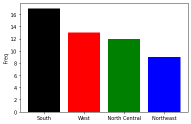
count.plot.bar(y='region',
               color=['black', 'red', 'green', 'blue'])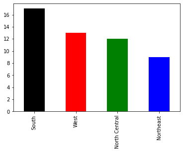
R에 있는 mtcars 데이터셋을 불러와 회사별 cyl, wt의 평균 막대 그래프를 그려보겠다.
mtcars = sm.datasets.get_rdataset('mtcars', 'datasets')
mtcars_dat = mtcars.data.copy()
mtcars_dat.head()

# 회사별 cyl, wt의 평균 막대 그래프
mtcars_dat['company'] = [s.split()[0] for s in mtcars_dat.index]
temp_dat = mtcars_dat.groupby('company')[['cyl', 'wt']].mean()
temp_dat.plot.bar()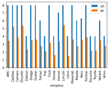
temp_dat.plot.bar(subplots=True, rot=45) # 그래프를 두 개로 나눔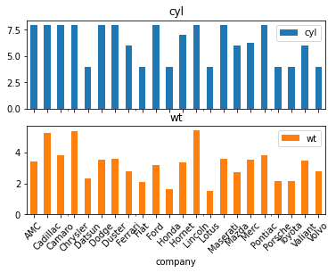
이번에는 pyplot을 이용해 위와 동일한 막대 그래프를 그려보겠다.
fig = plt.figure()
ax1 = fig.add_subplot(211)
ax2 = fig.add_subplot(212)

ax1.bar(x=range(temp_dat.shape[0]),
        height=temp_dat.cyl,
        color='red')
ax2.bar(x=range(temp_dat.shape[0]),
        height=temp_dat.wt,
        color='blue')

ax1.set_xticks(range(temp_dat.shape[0]))
ax1.set_xticklabels(temp_dat.index)
ax1.tick_params(rotation=45)

ax2.set_xticks(range(temp_dat.shape[0]))
ax2.set_xticklabels(temp_dat.index)
ax2.tick_params(rotation=45)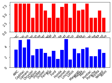
- set_xticks에 range를 이용해 회사 개수만큼의 x축 값들을 설정해주고 set_xticklabels를 이용해 회사 이름을 x축 label로 지정해준다.
- tick_params를 이용해 x축 이름의 기울기를 정해준다.
side-by-side bar plot
두 개의 bar plot 따로 그리지않고 바로 옆에 나란히 그려보겠다.
fig = plt.figure()
ax = fig.add_subplot(111)

width = 0.3
ind = np.arange(temp_dat.shape[0])
bar1 = ax.bar(x=ind,
              height=temp_dat.cyl,
              width=width,
              color='red')
bar2 = ax.bar(x=ind + width, #bar1과 겹쳐지지 않게 하기위함
              height=temp_dat.wt,
              width=width,
              color='blue')

ax.set_xticks(ind + width / 2)
ax.set_xticklabels(temp_dat.index)
ax.tick_params(rotation=45)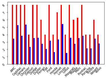
seaborn을 이용해 막대 그래프 그리기
state_region = sm.datasets.get_rdataset('usa_states', 'stevedata')
state = state_region.data.copy()
state.head()
count = state.region.value_counts()

# 그래프 그리기
count2 = count.reset_index(drop=False)
sns.barplot(x='index',
            y='region',
            data=count2)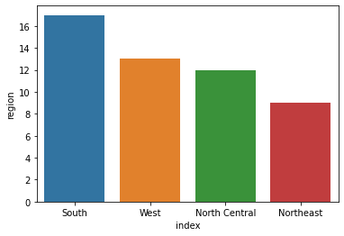
short-form 형식의 데이터셋을 company를 기준으로 long-form으로 melting 시켜 그래프를 그려보겠다.
melting은 melt함수를 이용해 가능하다.
long-form으로 바꾸면 회사별 cyl와 wt의 평균을 막대그래프로 볼 수 있다.
temp2 = temp_dat.reset_index(drop=False).melt(id_vars='company')
a = sns.barplot(x='company',
            y='value',
            hue='variable',
            data=temp2)
a.set_xticklabels(a.get_xticklabels(), rotation=45)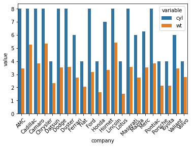
실습 : iris 데이터를 이용한 막대 그래프 및 t-검정
iris의 Species별로 각 변수들의 평균 그래프를 그려보겠다.
iris = sm.datasets.get_rdataset('iris', 'datasets')
iris_dat = iris.data.copy()

iris_melt = iris_dat.melt(id_vars='Species')
iris_melt.groupby(['Species', 'variable']).mean()

sns.barplot(x='variable',
            y='value',
            hue='Species',
            data=iris_melt,
            ci=95)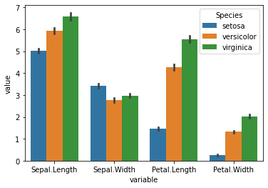
위 코드에서 그래프를 그릴 때 mean()값을 넣어주지 않더라도, 여러 개의 값이 들어가면 자동으로 평균으로 계산되어 그래프를 그려준다. 또한, 여기서 ci는 신뢰구간을 의미한다.
=> 실제 각 변수들이 Species별로 유의미한 차이가 있다고 할 수 있는가?
=> 유의미한 차이가 있는지 막대 그래프에 나타내려면 어떻게 해야하는가?
Species별 평균 막대그래프에 표준오차까지 표현하기
def se(x):
    res = x.std() / np.sqrt(x.shape[0])
    return res

se = lambda x : x.std() / np.sqrt(x.shape[0])

# 그룹별로 변수값을 나타내기 위해 long-form으로 만듦
iris_mean = iris_dat.melt(id_vars='Species').groupby(
    ['Species', 'variable']).agg({'value':['mean', se]})

iris_mean.reset_index(drop=False,
                      inplace=True)

# 변수명 변경
iris_mean.rename(columns={'<lambda_0>' : 'se'}, inplace=True)

# 그래프 그리기
fig = plt.figure()
ax = fig.add_subplot(111)
width = 0.3 ; n = iris_mean.shape[0]
n_type = iris_mean.variable.unique().shape[0] #변수의 개수
n_spe = iris_mean.Species.unique().shape[0]  #종의 유니크한 개수

grid = [0 + width * i for i in range(n)]
grid = grid + np.repeat(range(1, n_type + 1), n_spe)

color = ['red', 'blue', 'green'] * n_type

bar = ax.bar(x = grid,
             height = iris_mean.value['mean'],
             width = width,
             color = color)

error = ax.errorbar(x = grid,
                    y = iris_mean.value['mean'],
                    yerr = 2 * iris_mean.value['se'], #y error
                    color = 'black',
                    fmt = " ") #신뢰구간끼리 연결짓는 선 없애기

#이 세 막대의 legend로 legend를 생성하라는 뜻
ax.legend((bar[0], bar[1], bar[2]),
          iris_mean.Species.unique())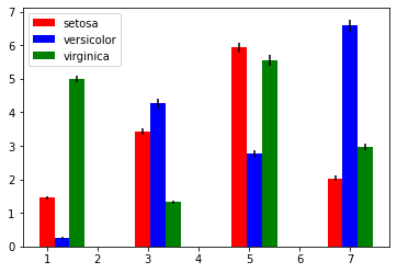
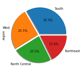
Pie chart
범주형 자료의 시각화에 파이 차트가 많이 사용된다.
파이 차트는 범주들의 비율을 원 그래프에 부채꼴 모양으로 나타낸 그래프이다.
파이 차트는 pyplot의 pie 함수로 그릴 수 있다.
state 데이터를 이용해 pie chart를 그려보겠다.
count = state.region.value_counts()
plt.pie(count,
        labels = count.index,
        autopct = '%.1f')

count.plot.pie(autopct='%.1f%%',
               shadow=True, # 음영
               explode=[0.05]*4) # pie들의 간격이 떨어짐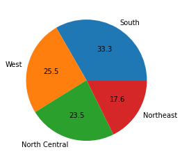
Boxplot
Boxplot은 연속형 데이터를 요약하고 시각화하는 대표적인 그래프이다.
다섯 수치 요약을 통해 나타난 그래프로 자료의 분포 및 이상치 등을 식별할 수 있다.
x = np.random.randn(100)

plt.boxplot(x=x)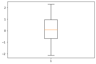

만약, 열이 여러 개인 데이터가 입력되면 각 열 별로 boxplot을 그린다.
또한, 각 상자의 색은 patch_artist인자와 set_facecolor method로 수정 가능하다.
# column 별로 boxplot 생성
box = plt.boxplot(iris_dat.drop('Species', axis=1),
            labels=iris_dat.columns.drop('Species'),
            vert=False,  # boxplot 가로로 그리기
            patch_artist=True)  # 상자 속 색 채우기

# box별로 색 다르게 지정해주기
color=['red', 'blue', 'green', 'yellow']
for b, col in zip(box['boxes'], color):
    b.set_facecolor(col)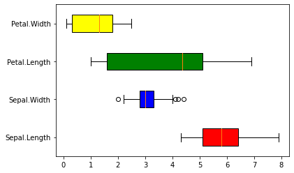
pandas DataFrame 객체의 boxplot method 이용
특정 변수에 대해서만 boxplot을 그리고 싶은 경우, column인자에 변수명을 입력한다.
iris_dat.boxplot(column=['Sepal.Length', 'Sepal.Width'])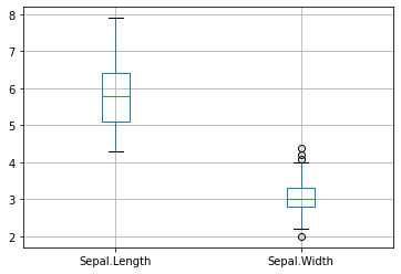
그룹별 boxplot은 by인자를 사용한다.
iris_dat.boxplot(column=['Sepal.Length', 'Sepal.Width'],
                 by='Species')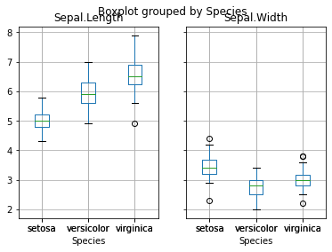
graphs = iris_dat.boxplot(column=['Sepal.Length', 'Sepal.Width'],
                 by='Species',
                 patch_artist=True,
                 return_type = 'dict') # dictionary


graphs[0].keys
graphs[0]['medians'][0].set_color('red')
graphs[0]['fliers'][2].set_markeredgewidthedgewidth(10)
graphs[0]['caps'][0].set_color('red')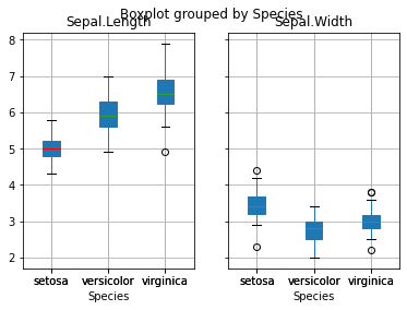
'Python > 데이터 시각화' 카테고리의 다른 글
| [Python] 그래프 그리기 - 3D plots / Interactive plots (0) | 2022.04.20 |
|---|---|
| [Python] 그래프 그리기 - Histogram / Customizing plots (0) | 2022.04.18 |
| [Python] 그래프 그리기 - 산점도 / 선그래프 (matplotlib, seaborn) (0) | 2022.04.17 |
| [Python] 조건문과 반복문 - if문 / for문 / while문 (0) | 2022.04.17 |
| [Python] Pandas - series와 dataframe 생성 / 인덱싱과 슬라이싱 / 함수 및 메서드 (0) | 2022.04.17 |


